Reading time: 4 minutes
What strikes you when you first see a brand? Although many may not mention it, the colours of your business play a key role. In fact, they can influence 90% of your audience's initial impression and 85% of their decision to buy.
There is a whole science behind the impact that colours have on the perception of your buyers, and this is where we talk about the psychology of colour.
In terms of branding and branding, colour combinations should not be random. This seemingly simple decision can increase or decrease your success rate, so it is necessary to use science to our advantage to support graphic communication. If it sounds complex, don't worry, we explain it here.
What is colour psychology?
According to the London Image Institute, colour psychology is an area of colour theory that assigns an emotional and psychological connotation to colours that is, for the most part, universal.
Colours are said to affect human behaviour and response. Therefore, they will also affect how your audience responds to the colours that accompany the messages your brand conveys.
>>4 reasons why Corporate Identity is important for your business
And while there is no guarantee that by using a particular colour all your potential customers will act in the same way, there is science-proven data that you can use to your advantage. For example, according to KissMetrics:
- 85% of shoppers surveyed said that colour is the main influence on their purchasing decisions.
- Colour increases brand recognition by 80%.
- Impulse buying is often influenced by the colours black, royal blue, red and orange.
These statistics are key to turning your business around to drive higher conversions. If you need an assessment of your current brand, you can request a meeting with our experts.
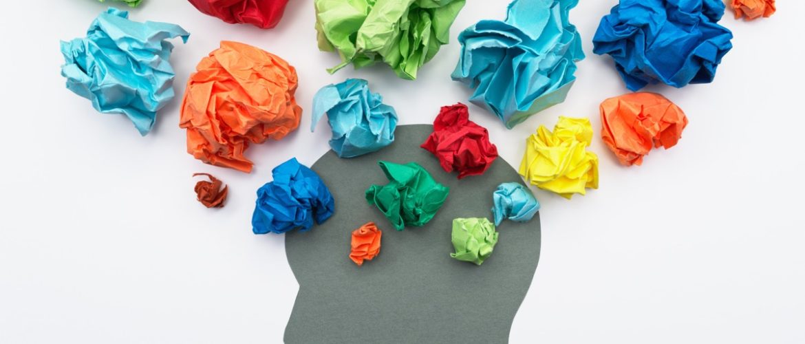
The psychology
of color

What do the colours say about my brand?
Let's do an exercise. Before thinking about what your brand should express, think about the colours you are currently using and here I will tell you what each of them tends to convey:
Blue
Meditation, professionalism, calm, confidence, relaxation.
Rosa
Optimism, classic, creativity, femininity, energy, youth.
Red
Boldness, energy, passion, emotion.
Yellow
Happiness, joy, creativity, optimism, extroversion.
Purple
Royalty, wealth, spirituality, imagination, extravagance, truth.
Black
Luxury, power, audacity, sophistication, elegance, masculinity.
Orange
Courage, warmth, comfort, passion, fun.
Green
Health, nature, wealth, growth, harmony, restoration.
White
Innocence, purity, neatness, simplicity, originality.
Is your brand really expressing what will attract more customers? Imagine choosing at first glance between two technology companies, one of which uses green for its communications and the other uses blue.
While blue represents stability, confidence and professionalism (which is why most large corporations use it), green transports you towards the organic, the natural. We definitely know which of these tech companies will capture the most attention at first glance.
How do I use colour to increase my conversion rate?

Conversion Rate Optimisation(CRO) is a fundamental element in the creation of your website, and its goal is to increase your ROI through lead conversion. So, to make your CRO more accurate through the use of colour, you will need to take into account more than just what each colour expresses on its own:
A gender issue?
According to Xerox Corporation, women and men prefer colours such as purple, green, red and blue in branding, with the difference that men are more attracted to bright shades. However, black and orange also stand out when it comes to conversion, regardless of gender.
Blue is the king of confidence
This may explain why most financial and technology institutions use shades of blue. Companies such as PayPal, Bank of America, HP, Intel and VISA need to express trust, security and loyalty to their audience. On the contrary, it is not highly recommended for food.
Use vibrant colours for your CTAs
Calls to action(CTAs) should, although it sounds obvious, attract attention. That is why it is convenient to use bright colours that attract your readers, such as red, blue and green. But beyond the colour, it is important that it contrasts with your website and that it doesn't look like just another ornament, as Amazon does with the orange on its buy button.
>>What is content marketing and why do I need it in my company?
The best way to know if your colours work is through statistics. But beyond the obvious, there is one element that can save you a lot of time and money: common sense.
In addition to a branding designer, have experts in content, customer behaviour and your industry on your side.
This will be a plus to deliver a consistent message that will attract more leads and increase your conversion rate. If you need support with this, at Innova Marketing Solutions we have experts who will transform your brand according to what science has proven to work, and we are ready to advise you. Make an appointment today!